
How to structure your Shopify navigation so customers can actually find your products
Disclaimer: This article contains affiliate links. If you decide to start a Shopify store using my link, I may receive a small commission at no extra cost to you. I only recommend products or services I love, and as Shopify designer, it’s no surprise that I’m a big fan of Shopify!
When someone lands on your Shopify store for the first time, your navigation is one of the first places they look.
They’ll quickly scan the menu to understand what you sell and how to explore your products. If that navigation feels clear and intuitive, customers move through your store easily. If it feels overwhelming or confusing, they often leave before they’ve even seen what you offer.
This is why navigation structure matters so much. Not only does it organise your pages, it guides customers through your store in a way that feels simple.
A well-structured Shopify navigation helps people find products faster, browse more confidently and ultimately move towards checkout more easily.
Why your Shopify navigation structure matters
When navigation works well, customers barely notice it. They instinctively know where to click and how to explore.
When it doesn’t work well, however, the experience quickly becomes frustrating. Too many menu options can make a store feel cluttered and difficult to navigate, especially on mobile. Visitors may open a menu, feel overwhelmed by the number of choices and leave rather than trying to figure it out.
Good navigation solves this issue, by helping your customers to move through your store in a way that actually makes sense and helping them to quickly find the products that interest them most.
This is especially important as your catalogue grows. What worked when you had ten products may no longer work when you have fifty or more.
Keep your top-level navigation simple
One of the most common mistakes I see on Shopify stores is trying to include too many options in the top-level navigation.
It’s understandable. As your business grows, you add new collections, pages and categories and they’re all important, to some extent. But, before long, the menu becomes crowded with options.
The problem is that customers don’t want to read through a long list of choices. Too many options actually make it harder for them to decide where to click.
Instead, think of your top-level navigation as a set of clear signposts that guide people through your store. It should highlight the most important pathways rather than every possible page.
For example, many Shopify stores structure their main navigation around links such as:
Shop or Shop all
Key product categories (such as Dresses, Skincare or Homeware)
New arrivals or Bestsellers
About the brand
Pages like FAQs, delivery information, returns policies or contact pages are still important, but they don’t necessarily need to sit in the main navigation. These are often better placed in a mega menu or in the footer, where customers naturally look for support information.
If you have a larger catalogue, this is where mega menus become particularly useful (more on them later). Instead of adding more and more links to the top level, you can keep your navigation simple while organising additional collections and categories within a structured dropdown menu.
This approach keeps the navigation clean while still making it easy for customers to explore everything you offer.
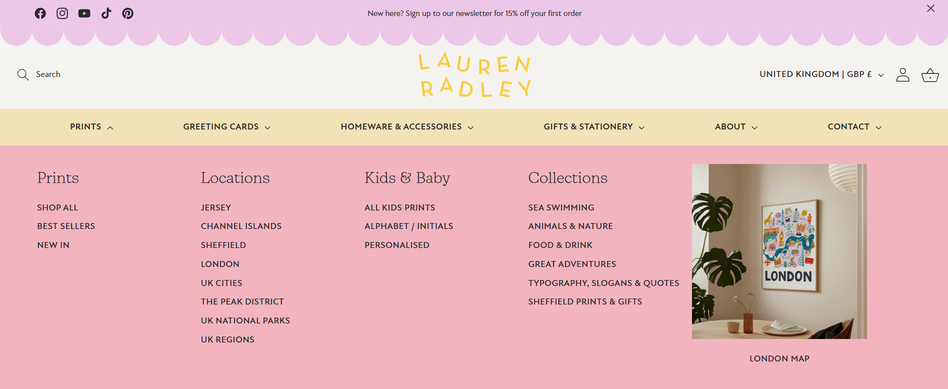
Group products into clear collections
Your collections should reflect how customers naturally shop.
For example, a clothing store might group items by product type, such as dresses, tops and trousers. A skincare brand might organise products by skin concern or routine.
If collections feel unclear or overly complicated, customers may struggle to find what they’re looking for.
It’s also helpful to avoid creating too many small collections unless they serve a clear purpose. A smaller number of well-organised collections is usually easier for customers to browse.
Think of your collections as signposts that guide people through your store.
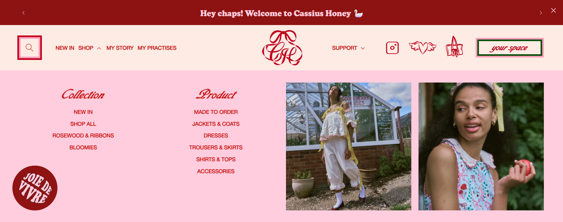
Gorgeous design by Hey Girl Studio for Cassius Honey and built by me
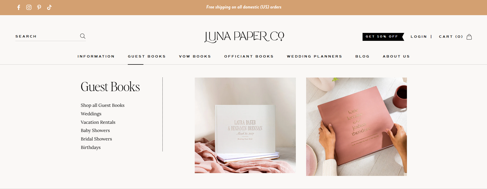
Use mega menus to organise larger catalogues
If your Shopify store has a larger catalogue, mega menus can make navigation so much easier and cleaner.
A mega menu expands the dropdown navigation into a wider panel, allowing you to group collections into clear categories. Instead of a long list of links, customers can see multiple sections at once, making it easier to scan.
For example, a fashion brand might structure a mega menu like this:
Women
Dresses
Tops
Knitwear
Jackets
Accessories
Bags
Jewellery
Scarves
This format allows customers to quickly understand your product range without feeling overwhelmed by too many options at once.
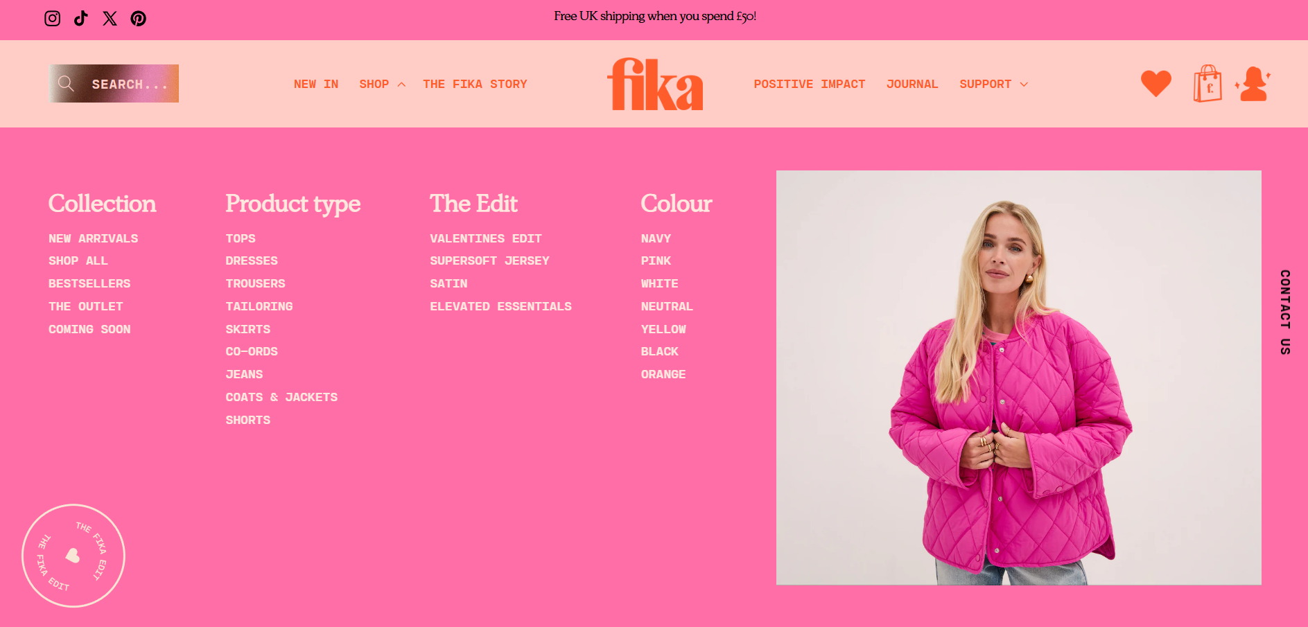
Gorgeous design by Hey Girl Studio for Fika and built by me
Use visuals within mega menus
One of the advantages of Shopify mega menus is that they can include images alongside links.
Adding visuals can make the menu more engaging and help customers discover products faster. For example, you might feature a bestselling product, highlight a new collection or show an image representing a category.
A skincare brand might show a product image next to a “Best sellers” link, or a clothing store might display a styled look alongside a “New arrivals” collection. These small visual cues help guide customers towards key products and encourage them to explore further.
Make sure the navigation works well on mobile
A large percentage of Shopify traffic comes from mobile devices, so your navigation needs to work just as well on a small screen as it does on desktop.
If your menu becomes too long or complicated, it can be difficult for customers to scroll through it comfortably on their phone.
Testing your navigation on mobile is essential. Open your store on your phone and see how easy it is to find specific products. If it takes several taps or feels slightly confusing, it may need simplifying.
With more and more customers shopping from mobile, clear mobile navigation can have a big impact on your conversion rates.
Your navigation should guide customers, not overwhelm them
Your Shopify navigation shouldn’t try to show everything at once. Instead, it should act like a guide through your store. It helps customers understand what you sell, find the products they’re interested in and explore your collections with confidence.
When navigation feels simple and well organised, people browse more comfortably and are far more likely to discover products they love.
If your Shopify store feels difficult to navigate
Sometimes the issue isn’t the number of products you sell, but how they’re organised.
Refining your collections, simplifying your navigation and introducing features like mega menus can make a huge difference to how customers experience your store.
I design strategic Shopify websites for product brands who want their stores to feel clear, intuitive and easy to shop. If you’d like help structuring your Shopify store so customers can find products more easily, you can explore my Shopify website design services or get in touch using my enquiry form here.
FAQs
-
There isn’t a strict rule, but in most cases keeping your top-level navigation fairly simple works best. Around five items is usually a good balance, but keep it to a maximum of 7. That’s enough to guide customers through your store without overwhelming them with too many choices.
If you have lots of collections or product categories, it’s usually better to organise them within dropdowns or mega menus rather than adding everything to the top level.
-
A mega menu is a larger dropdown navigation that opens into a wider panel instead of a simple list of links. It allows you to organise collections into clear groups so customers can quickly scan what you offer.
They’re especially useful for stores with bigger catalogues because they make it much easier for shoppers to explore your products without feeling overwhelmed by a long list of menu items.
-
If you’re using a mega menu, adding images can work really well. Featuring a product, collection or small lifestyle image alongside your links can help guide customers towards key areas of your store.
It also makes the navigation feel more engaging and visually interesting, which can encourage people to keep exploring.
-
No, your main navigation should focus on helping customers shop your products and understand your brand.
Support pages like shipping information, returns policies, FAQs and terms are still important, but they usually work better in the footer where customers expect to find them. Keeping your main navigation focused makes it much easier for people to browse your store.